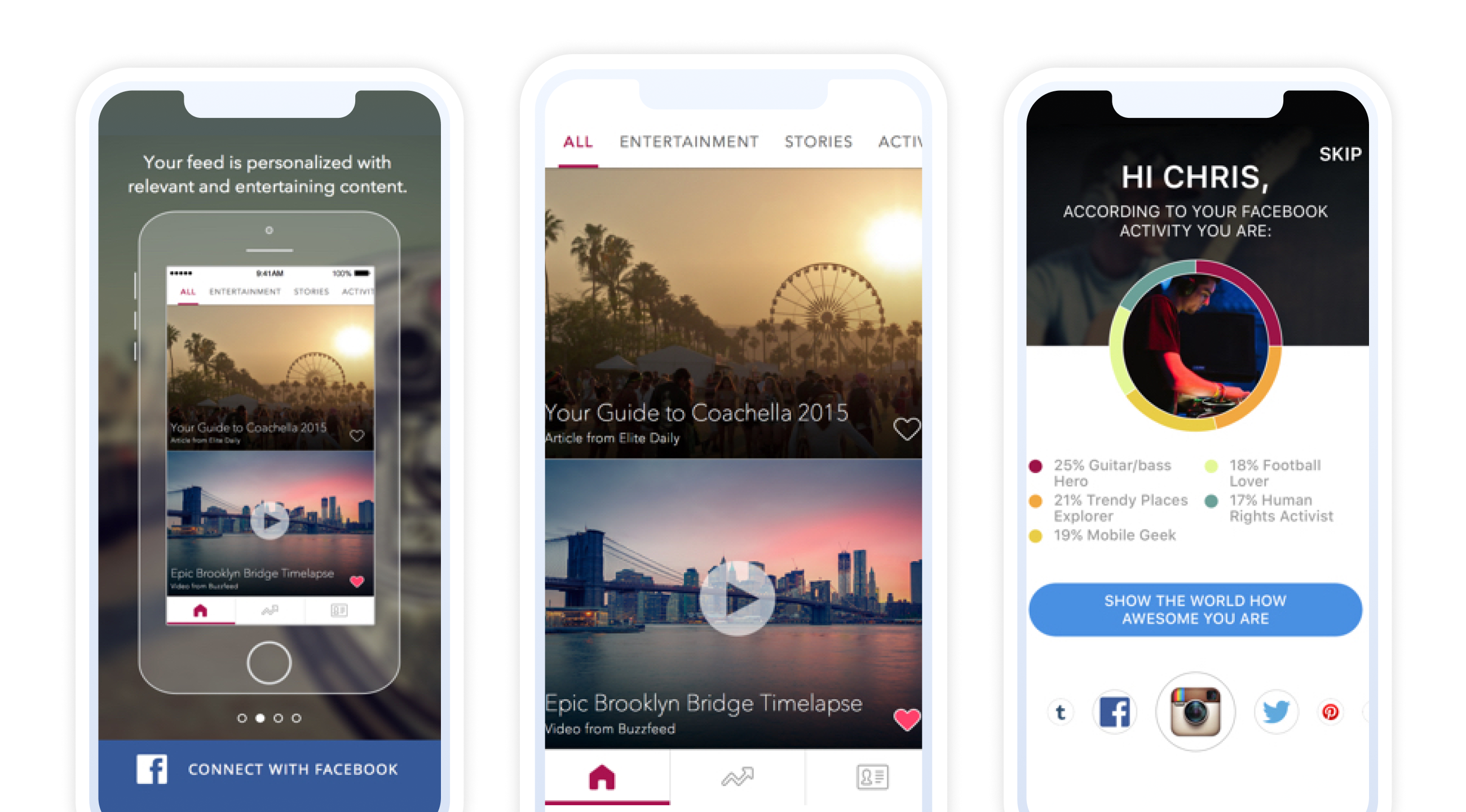
Freshfeed is an app designed and developed by Fligoo, which I consulted as a Design director for. It is an “interest aggregator” that will scour through your social media likes, posts, events, etc. and serve up relevant news articles, event invites, photos and videos you will enjoy.
Lead Product Designer
Product Design
Product Strategy
User Research
Design QA
Prototyping
Lucas Olmedo, Founder / CEO
Chris O'Boyle, Creative Director / Designer
Marcos Martinez, Engineer
Andres Laiseca, Engineer
Ilya Shrevyesky, Marketing
David Pava, Marketing
Chris O'Boyle, Research

I was brought on to Fligoo as a Creative Director consultant. They had a goal to launch a brand new product within 6 months. This included design, testing, development and all marketing assets being created.
The basic concept of the app is as follows: After connecting your Facebook account to the app, it would scrub through your posts, photos, likes, groups you are in, and events you’ve attended to gather insight on things you’re interested in. The algorithm then suggests different types of content such as articles, events, photos and videos to you.
I was responsible for not only the design of the app, but the creative direction of the overall brand including logos, colors, and social media strategy.


Initially I met with all of the developers to understand their algorithm. Fligoo was a technology company, but no consumer facing product to surface their tech. First we needed to define our audience and that would determine the path we take.

First we needed to identify our audience and market to go after. I worked alongside two market researchers to gather data and help define who we are designing for. Working with the CEO, CMO and our marketing researchers, we decided to develop a product that will capture the millennial market. This was by far the largest market and highest users of social media

One characteristic of millennials is that they are always on the go, attending parties, going to school, work, etc, and they want to consume information in the shortest, most concise way as possible. Social media exploded on mobile so we were going to tackle that platform first, and potentially expand to a desktop offering in the future.

Created basic wireframes to get an understanding of how the app might look or behave. Also to give the developers and idea of the direction the design was taking to get a head start on the front end development.

I built a fully fledge prototype to get initial reactions from users. We tested things like app layout, login mechanism, icons, name, etc. We did an unmoderated study with 100 participants through usertesting.com and then a moderated study with 10 participants to get more qualitative data.

We also wanted to get a lot of feedback on the overall branding, not just in terms of design, but a company as a whole. Although Fligoo, was the original company behind the tech, we found that users did not associate that with any meaningful action or content. After all, it is a made up word. We wanted to find something that resonated on the emotional level with users. We threw a round of testing and the marketers went to work surveying customers and after some internal debate as to which final name to go with based on the research, we decided Freshfeed is the winner. Users associated this with content from their feed that is recent, current and they get it before anyone else. We needed to live up to this assumption.

Some of the other icons we tested. The plane with multiple colors was the winner as it showed it would "deliver" things to the user. We wanted to make it more in line with our brand, and felt the burgundy color really popped and grabbed the users attention.


