Facebook profiles, clearer across four profile types
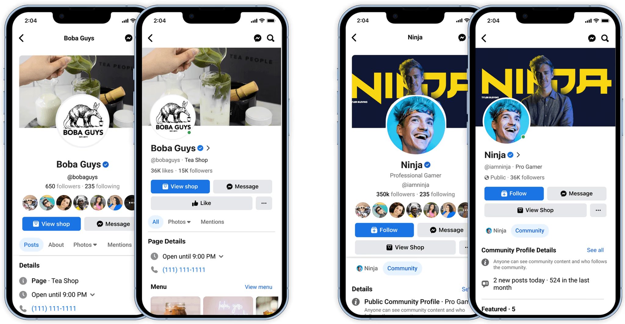
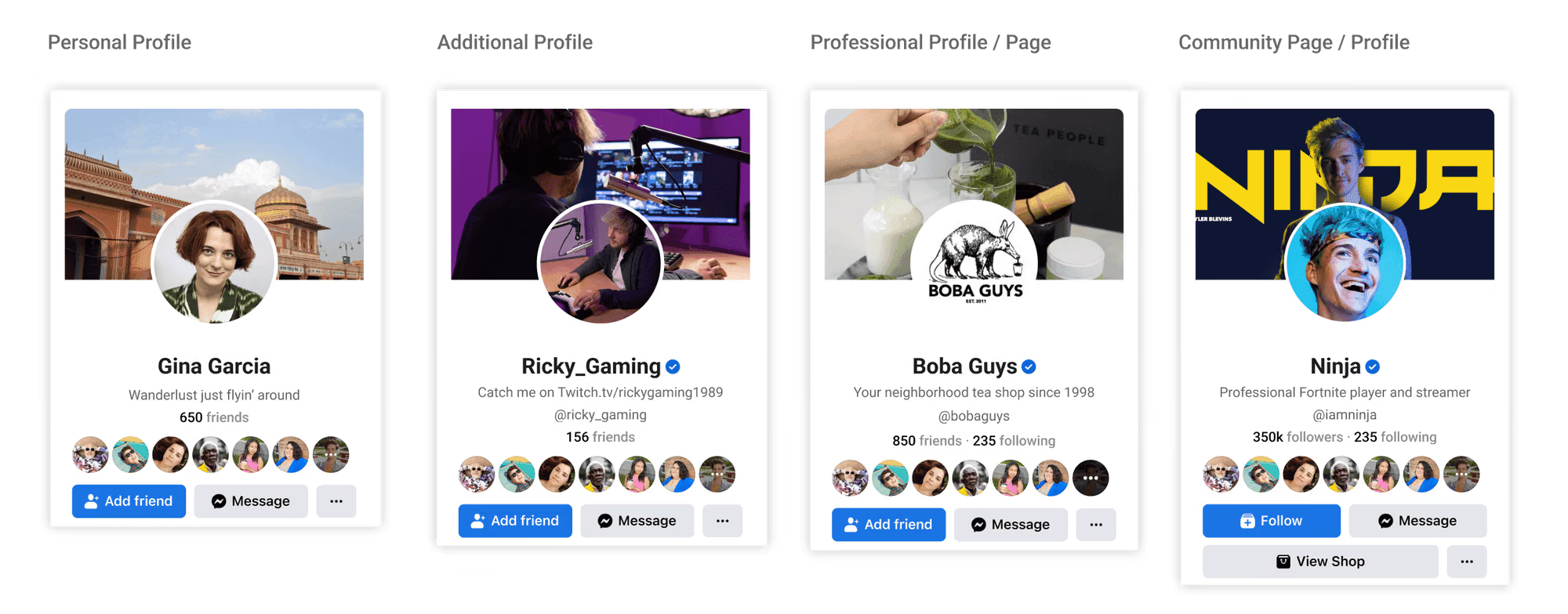
Facebook has four profile types: personal, additional, professional and community. People couldn’t tell them apart, and the header was cluttered. The redesign had to make each type clear and keep integrity information visible while taking up less space.
- Role
- Senior product designer
- Worked with
- Privacy, Legal, Integrity and Product partners
- Timeline
- 6 months
- I owned
- Strategy, research, prototyping and visual design
- Outcome
- Scroll engagement up 64%, with every integrity requirement kept
Decision 01
Map the constraints before designing
- Situation
- The project started with an executive concern that profiles felt cluttered. Any change to the header touched privacy, integrity and policy, and Legal required business entities to be identified.
- Choice
- Before any concepts, I collected requirements from each partner team and audited the current experience across all four profile types.
- Why
- I needed to know which integrity signals had to stay visible, and how far they could move without breaking compliance.
Decision 02
Change the structure instead of adding a label
- Situation
- Our first pass added a new element to signal profile type: icons, subtle labels, or the category alone. Partner reviews set firm limits. The “i” integrity entry point had to stay visible, nothing new could sit near the avatar because that space is reserved for online status, and category labels didn’t read as tappable.
- Choice
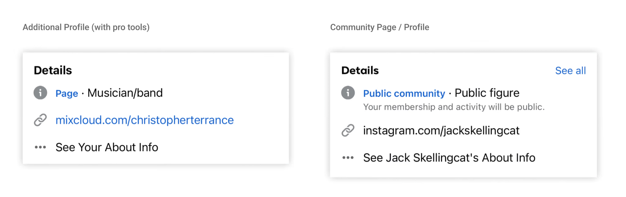
- We moved to structural changes, testing labels in the header and in the details area. Each version went through Privacy, Legal and Integrity review.
- Why
- At Facebook’s scale, with localization, every new element is expensive.
Decision 03
Win back space in the header
- Situation
- A content-first initiative asked for a smaller header.
- Tested
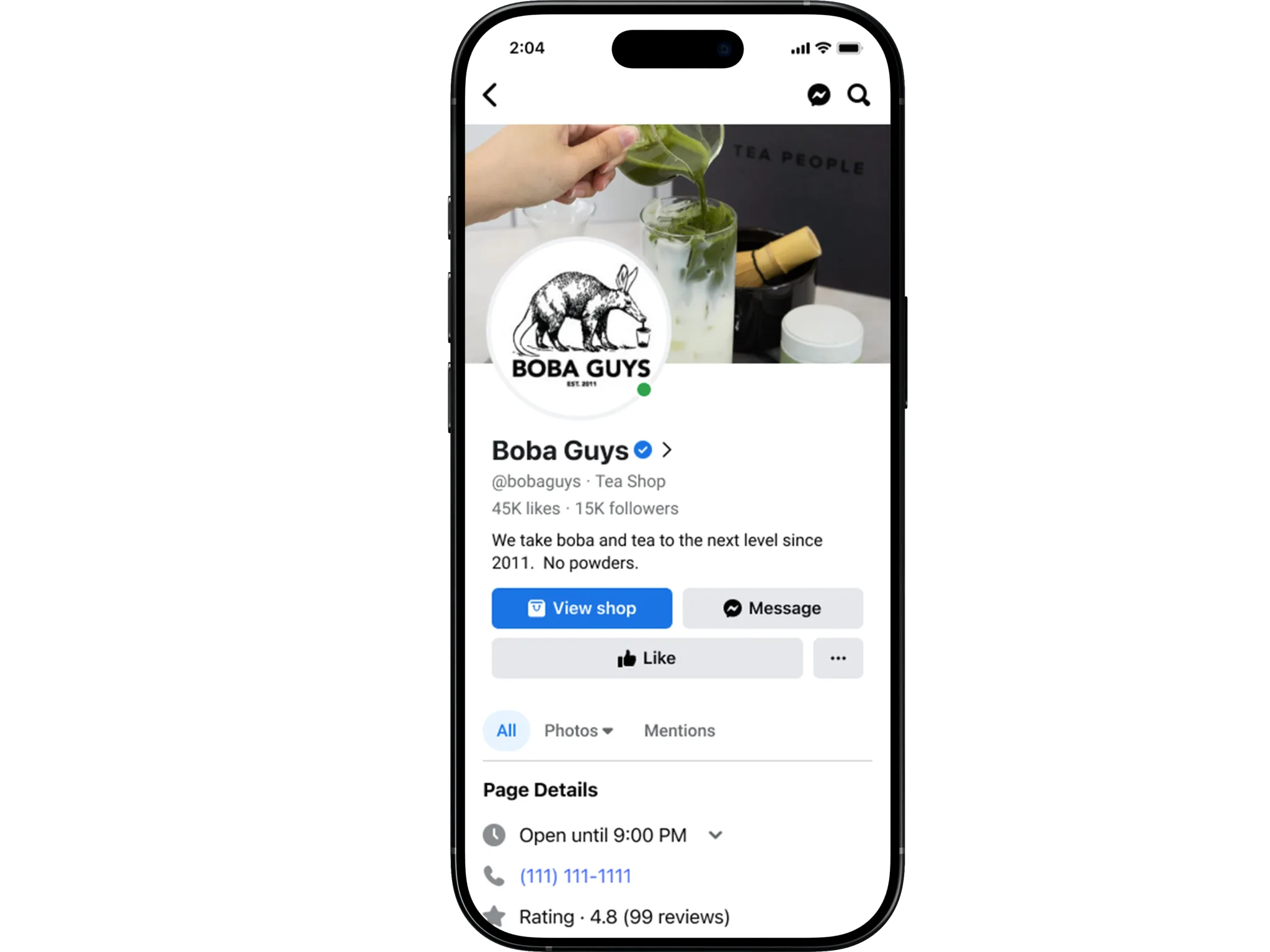
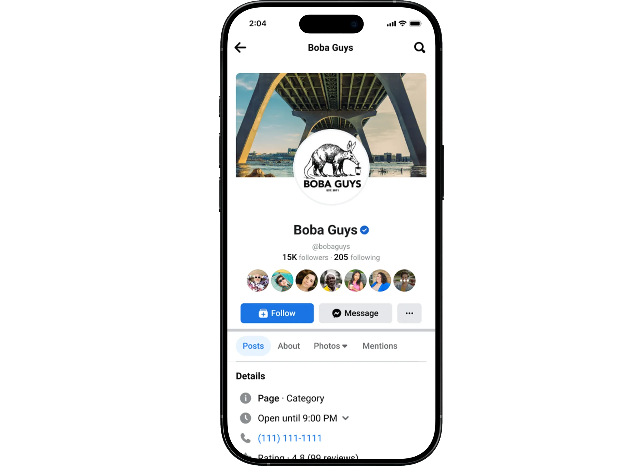
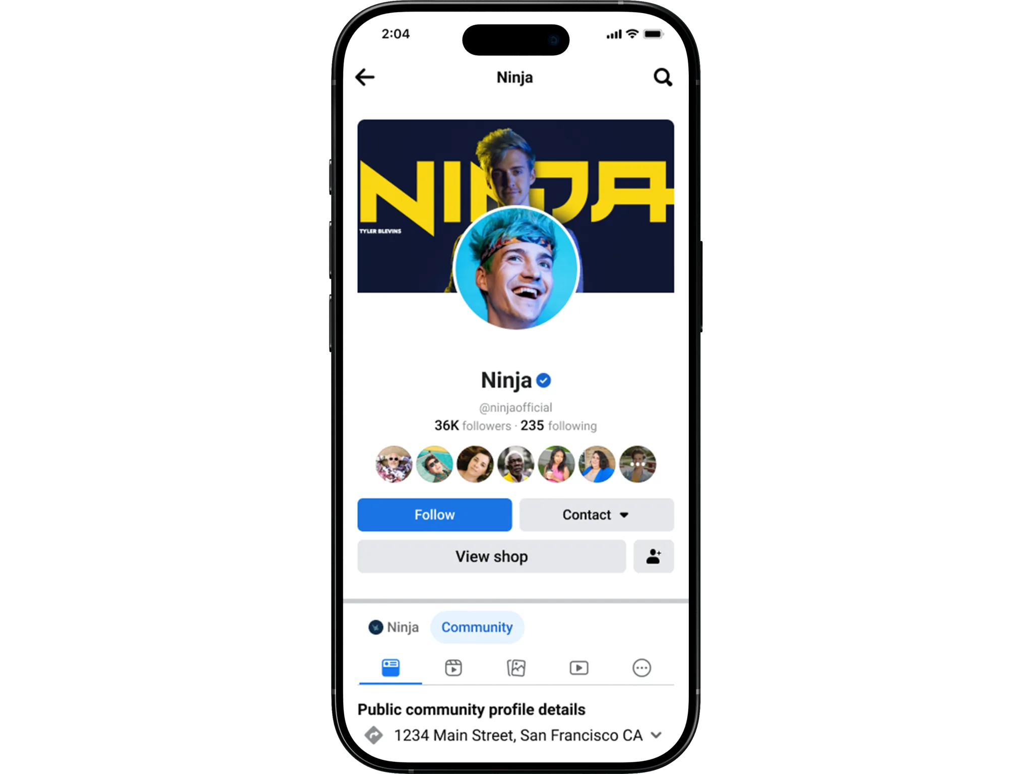
- Left-aligned profile photos, a smaller avatar, a shorter cover photo, and details condensed into fewer lines.
- Result
- About 54 pixels of usable space. The change raised new privacy requirements, which we then had to meet.
Decision 04
Separate the profile label from the integrity entry point
- Situation
- In testing, too much visible information weakened the page. People wanted to know whether a profile was personal or professional, and participants in Brazil cared about whether a profile could advertise.
- Choice
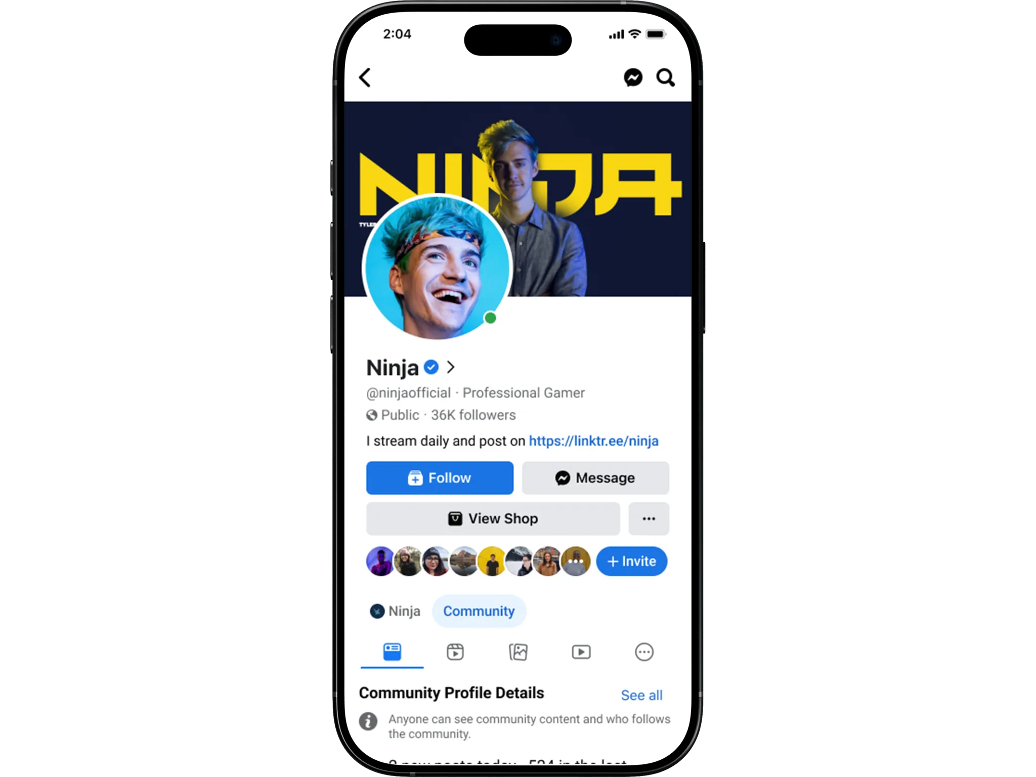
- The profile-type label and the integrity entry point became separate elements. The arrow now goes straight to integrity information, and every required element stays within one tap. We applied the same structure to additional, professional and community profiles, keeping existing differentiators like CTA placement, usernames and the verified badge.
- Why
- Integrity information had to stay within one click, and telling types apart didn’t have to rely on a text label.
Results
+64%
scroll engagement
−8%
bounce rate
+15%
room for profile and cover photos
All
integrity and compliance requirements kept
What I learned
- 1
Show less, unless it’s critical.
Progressive disclosure worked best for everything except the signals people needed to see right away.
- 2
Regional differences matter.
What people needed to know about a profile varied by market.
- 3
Few people knew the types differed.
Most participants didn’t know that different profile types had different features.
Most of this project was getting Privacy, Legal, Integrity and Product to agree on the same few pixels. Treating that alignment as part of the design work is what made the layout come together.